

Canva: design made easy and free
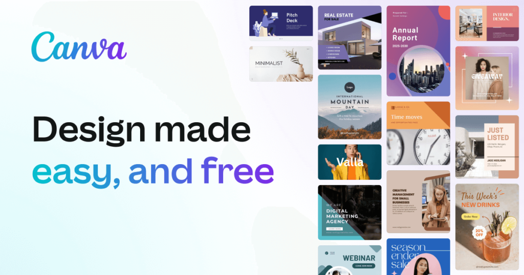
Canva’s templates provide a shortcut to good design: they’re fully customizable, so you can change the colors, images and more to suit your taste. We’ve got tens of thousands of templates for every design need.
But sometimes you need something completely custom-made. How do you ensure what you create actually looks good?
In this article, you will learn:
- How to create a design from scratch using Canva
- Quick tips to make your designs look good
- How to choose the dimensions for your design
- How to create a background for your design
- How to add text, images and more
Watch the video to see for yourself how simple it is to design from scratch in Canva.
Design tip: Sketching a rough outline of your design on paper before you begin can help you bring your vision to life. It doesn’t need to be perfect. Consider what you’d like to include in the design, and where it might look best.
Ready? Let’s get started.
01. Choose the right dimensions for your design
To begin, choose your design type from the Canva homepage. These are set to the optimal dimensions for each graphic, whether it’s a social media post, flyer or more. Or you can use custom dimensions by searching for “custom size”. You can choose from pixels, millimetres or inches.
02. Choose a background
The background for your design could be a color, or an image.
Background colors
Design tip: Different colors tell different stories. Purple is associated with individuality, orange relates to activity, and green conjures images of nature. Think about what colors best suit your needs. Find a good color combination with our color palette tool.

Of course, you can always use a white background too.
To choose a color, use the Color Picker tool in the toolbar at the top of the editor.
Background photos
To use a photo as a background, first add a grid. Once placed on a grid, photos can be resized, cropped, flipped and layered to create a variety of visual effects.
Next, search Images or upload your own. Then drag and drop your image onto the grid: it will snap to fit.
You can add filters to change the brightness, saturation and clarity of the photo. This can help when layering text and elements.
Design tip: You can add background images or feature images to your design.
A background image supports the message of the content. If there’s too much going on in the background, it’s hard to overlay things like text or illustrations. When you are choosing a background image for your design, consider texture over structure. You can crop images to find pockets of texture that will work better—this way you can also remove any space or features in the image that creates too much noise.
The image below uses a close up photograph of a rose to add textural interest to the design, but its main role is to act as a vehicle for the text.

A feature image becomes the focus of your design: this image sits high in the order of visual hierarchy. Use a single, or split-cell grid to apply clever feature images and help your content sing.
The image below uses a grid to balance the visual hierarchy of the design. The user’s eye is drawn to the photograph.

3. Add your elements
Your design might include text, icons, photos or illustrations. These need to be combined in a way that is visually appealing.
Canva graphic designer Lynneal Santos says it’s a matter of balance. “Consider the balance and composition of all the elements in the design. When you’re laying out your elements, ask are the elements balanced? Are they centered? And ensure they’re not too close to other elements or the edge of the page.”
Her number one tip? “Keep it simple.” Don’t overload your design with too many elements, as it can confuse the visual message of the image. This is something designers call visual heirarchy, which involves the arrangement of elements according to their importance. Try playing with size, color, and placement in order to see what works best.
If you want to add a photo to your design, try using one of Canva’s frames. You can find these under “elements” in the side panel.
Design Tip: Harness the power of negative space. Negative space, also known as white space can be any area within a design that is free from text, images, or embellishments (it doesn’t have to actually be white). Designers love it because it can help create grouping, add emphasis and improve legibility.
4. Choose the right fonts
The look of your fonts can have a huge impact on your design. Take a look at this playful typeface: perfect for a fun beauty brand. Not ideal for a law firm.
")
Choosing one font is hard enough. But your design may need more than one typeface. Canva suggests never using more than two fonts in a design, as too many fonts tends to make a design look “messy”. You’ll want to choose complementary fonts, which add visual interest while working well together. You can learn more about which fonts look good together with tips on font pairing.
Canva has hundreds of pre-set font combinations to choose from. You can find these in the Text tab in the side panel.

Or you can create your own combination. Again, simple is best: if you’re choosing an elaborate font, ensure you pair it with a simpler font so your design is balanced. Canva’s Font Combination tool can help, and Traditional combinations like a sans serif font and a serif font can be very powerful.
Don’t forget about readability. If your fonts are too complicated, they can detract from your message.
Design tip: Typographic hierarchy establishes the order of importance given to different design elements. By applying different fonts, color and scale to your text, you can dramatically change the way your message is received.

You don’t have to study for hundreds of hours to be good at design. But, like most things in life, you’ll get better with practice, so don’t be disheartened if your first design doesn’t turn out perfectly. Instead, keep practicing and keep creating. You’ll be creating brilliant, polished images in no time.
Source: canva.com